
I was wondering if I shouldn't simply post once a week, regular like - but I'm not that sort of person. Why wait?
Here we go. Let's start with one of my favourites. THE DARK IS RISING SEQUENCE...
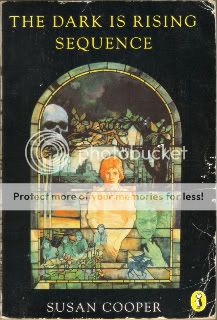
I love this cover. It says everything about the feeling that I get now - and got as a child - from the books that make up the sequence. Expect scans of the covers of individual novels in the future, they too were wonderful. Does anybody out there know anything more about the artist who did this, Michael Heslop? Or Maggie Heslop, who seems to have a very similar style? Are they related? Is one a pseudonym? Any info greatfully recieved. Something about this cover emanates foreboding. It says that this will not be easy. It may even be dangerous. That the world of this story is right out there around you, so you had better watch out.
The film did not come close to doing any kind of service to Susan Coppers book. It seems a shame to me that it wasn't made into a childrens TV series of the kind they used to make that scared the shit out of you just before you had your tea. You know the ones: CHILDREN OF THE STONES, THE OWL SERVICE and the like.
Next up, THE GIANT UNDER THE SNOW:

We read this at school, or at least we started. I went on Holiday part way in and didn't read the end for many years to come. John Gordon, though, came to our school. The first author I ever saw in the flesh. Our teacher had made us all write a novelette. Something that seemed insurmountable when first sprung on us, but now seems like a gift. A wonderful thing to do, if for no other reason than making us write something that long and finish it, show us that we COULD.
Mr. Gordon judged them and picked some of the best. Mine wasn't one of them. Mine was a stitch-up worthy of Victor Frankenstein, mixing elements from THE MONSTER SQUAD, Terence Fisher's DRACULA, THE LOST BOYS, WARLOCK (Julian Sands not Jimmy Stewart), a little bit of a kids horror story by Terence Dicks that might have been called VAMPIRE!,a dash of THE GOLDEN CHILD, and lines of dialogue nicked from THE PRINCESS BRIDE and REAL GENIUS. Oh, and a demon on the cover that I copied from a junior edition of THE DEVIL RIDES OUT (a junior edition, I swear to god!). Glad to say I've since moved out from underneath the influences, but I think I stitched all together fairly well...
Again I'm drawn to why these covers so appeal to me, why the touch me and seem to me so RIGHT. Looking at them agaain, I think it's something to do with colour, their attatchment to the landscape. They seem to represent stories and ideas that are palpable connected to the landscapes in which they are set, and the world in which we live, all the while also finding deep resonance and immediate connection to the weight of mythic history imbeded in the culture, traditions and indeed the LAND around us and on which we stand. Current writing, and covers - on the whole - don't seem to have that (David Almond being a big exception, Cooper and Wynne Jones likewise). Much of what is written today, and certainly the way it's represented in the cover art seems as divorced from reality, lived experience and perhaps more importantly emotional/imaginative experience (which let's face it holds more sway when we are young - the world around us being far more maleable, much les set, much more new to us, much less understood).
Anyway, it's a thought. There'll be more. I'll end on some that are less personally connected to me, more upbeat, but no less wonderful. I think these are lovely covers.

Front... and back...


You might notice that all of these are Puffin books. Time was when they not only lead the children's field, they almost were the childrens field. It's a much more crowded market these days. But still I can't help but think that Puffin might have lost there way, just a little. I'd like to see them get the brand back on top. Historically, it just seems to be where they belong.
TO BE CONTINUED... (sometime)

