Signed the lease today.
Had a declaration sworn - first time I've had to 'repeat after me' since I got married, which made me smile and gave the whole moment happy and exciting associations.
So excited to get in and get started. Get to know you all. And bring you GOOD BOOKS!
Neil.

Wednesday, 24 June 2009
Sunday, 21 June 2009
Doorways to the worlds within...
Ah bugger it. I was going to leave it for a while, give people a chance to read the other post, maybe even wait until I was acually installed in the shop behind the counter before I followed up on the book covers post, but enthusiasm is getting the better of me (read previous two blog entries for context on what I'm talking about here).
I was wondering if I shouldn't simply post once a week, regular like - but I'm not that sort of person. Why wait?
Here we go. Let's start with one of my favourites. THE DARK IS RISING SEQUENCE...
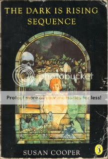
I love this cover. It says everything about the feeling that I get now - and got as a child - from the books that make up the sequence. Expect scans of the covers of individual novels in the future, they too were wonderful. Does anybody out there know anything more about the artist who did this, Michael Heslop? Or Maggie Heslop, who seems to have a very similar style? Are they related? Is one a pseudonym? Any info greatfully recieved. Something about this cover emanates foreboding. It says that this will not be easy. It may even be dangerous. That the world of this story is right out there around you, so you had better watch out.
The film did not come close to doing any kind of service to Susan Coppers book. It seems a shame to me that it wasn't made into a childrens TV series of the kind they used to make that scared the shit out of you just before you had your tea. You know the ones: CHILDREN OF THE STONES, THE OWL SERVICE and the like.
Next up, THE GIANT UNDER THE SNOW:

We read this at school, or at least we started. I went on Holiday part way in and didn't read the end for many years to come. John Gordon, though, came to our school. The first author I ever saw in the flesh. Our teacher had made us all write a novelette. Something that seemed insurmountable when first sprung on us, but now seems like a gift. A wonderful thing to do, if for no other reason than making us write something that long and finish it, show us that we COULD.
Mr. Gordon judged them and picked some of the best. Mine wasn't one of them. Mine was a stitch-up worthy of Victor Frankenstein, mixing elements from THE MONSTER SQUAD, Terence Fisher's DRACULA, THE LOST BOYS, WARLOCK (Julian Sands not Jimmy Stewart), a little bit of a kids horror story by Terence Dicks that might have been called VAMPIRE!,a dash of THE GOLDEN CHILD, and lines of dialogue nicked from THE PRINCESS BRIDE and REAL GENIUS. Oh, and a demon on the cover that I copied from a junior edition of THE DEVIL RIDES OUT (a junior edition, I swear to god!). Glad to say I've since moved out from underneath the influences, but I think I stitched all together fairly well...
Again I'm drawn to why these covers so appeal to me, why the touch me and seem to me so RIGHT. Looking at them agaain, I think it's something to do with colour, their attatchment to the landscape. They seem to represent stories and ideas that are palpable connected to the landscapes in which they are set, and the world in which we live, all the while also finding deep resonance and immediate connection to the weight of mythic history imbeded in the culture, traditions and indeed the LAND around us and on which we stand. Current writing, and covers - on the whole - don't seem to have that (David Almond being a big exception, Cooper and Wynne Jones likewise). Much of what is written today, and certainly the way it's represented in the cover art seems as divorced from reality, lived experience and perhaps more importantly emotional/imaginative experience (which let's face it holds more sway when we are young - the world around us being far more maleable, much les set, much more new to us, much less understood).
Anyway, it's a thought. There'll be more. I'll end on some that are less personally connected to me, more upbeat, but no less wonderful. I think these are lovely covers.

Front... and back...

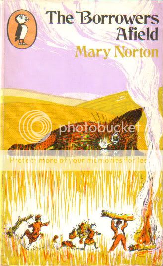


You might notice that all of these are Puffin books. Time was when they not only lead the children's field, they almost were the childrens field. It's a much more crowded market these days. But still I can't help but think that Puffin might have lost there way, just a little. I'd like to see them get the brand back on top. Historically, it just seems to be where they belong.
TO BE CONTINUED... (sometime)
I was wondering if I shouldn't simply post once a week, regular like - but I'm not that sort of person. Why wait?
Here we go. Let's start with one of my favourites. THE DARK IS RISING SEQUENCE...
I love this cover. It says everything about the feeling that I get now - and got as a child - from the books that make up the sequence. Expect scans of the covers of individual novels in the future, they too were wonderful. Does anybody out there know anything more about the artist who did this, Michael Heslop? Or Maggie Heslop, who seems to have a very similar style? Are they related? Is one a pseudonym? Any info greatfully recieved. Something about this cover emanates foreboding. It says that this will not be easy. It may even be dangerous. That the world of this story is right out there around you, so you had better watch out.
The film did not come close to doing any kind of service to Susan Coppers book. It seems a shame to me that it wasn't made into a childrens TV series of the kind they used to make that scared the shit out of you just before you had your tea. You know the ones: CHILDREN OF THE STONES, THE OWL SERVICE and the like.
Next up, THE GIANT UNDER THE SNOW:
We read this at school, or at least we started. I went on Holiday part way in and didn't read the end for many years to come. John Gordon, though, came to our school. The first author I ever saw in the flesh. Our teacher had made us all write a novelette. Something that seemed insurmountable when first sprung on us, but now seems like a gift. A wonderful thing to do, if for no other reason than making us write something that long and finish it, show us that we COULD.
Mr. Gordon judged them and picked some of the best. Mine wasn't one of them. Mine was a stitch-up worthy of Victor Frankenstein, mixing elements from THE MONSTER SQUAD, Terence Fisher's DRACULA, THE LOST BOYS, WARLOCK (Julian Sands not Jimmy Stewart), a little bit of a kids horror story by Terence Dicks that might have been called VAMPIRE!,a dash of THE GOLDEN CHILD, and lines of dialogue nicked from THE PRINCESS BRIDE and REAL GENIUS. Oh, and a demon on the cover that I copied from a junior edition of THE DEVIL RIDES OUT (a junior edition, I swear to god!). Glad to say I've since moved out from underneath the influences, but I think I stitched all together fairly well...
Again I'm drawn to why these covers so appeal to me, why the touch me and seem to me so RIGHT. Looking at them agaain, I think it's something to do with colour, their attatchment to the landscape. They seem to represent stories and ideas that are palpable connected to the landscapes in which they are set, and the world in which we live, all the while also finding deep resonance and immediate connection to the weight of mythic history imbeded in the culture, traditions and indeed the LAND around us and on which we stand. Current writing, and covers - on the whole - don't seem to have that (David Almond being a big exception, Cooper and Wynne Jones likewise). Much of what is written today, and certainly the way it's represented in the cover art seems as divorced from reality, lived experience and perhaps more importantly emotional/imaginative experience (which let's face it holds more sway when we are young - the world around us being far more maleable, much les set, much more new to us, much less understood).
Anyway, it's a thought. There'll be more. I'll end on some that are less personally connected to me, more upbeat, but no less wonderful. I think these are lovely covers.
Front... and back...
You might notice that all of these are Puffin books. Time was when they not only lead the children's field, they almost were the childrens field. It's a much more crowded market these days. But still I can't help but think that Puffin might have lost there way, just a little. I'd like to see them get the brand back on top. Historically, it just seems to be where they belong.
TO BE CONTINUED... (sometime)
Friday, 19 June 2009
Never Judge A Book By It's Cover?
That's what they say isn't it?
And it's sound advice. I've seen some atrocious covers desectrating otherwise wonderful books.
And yet...
And yet, I've got something of an obsession with book covers, especially old ones. That's partly nostalgic. There's a certain type of cover that graced the books in the library when I was growing up that really does affect the way I see the world when I look back. And still colours the way I see the world today.
But it's also because they were often simply better back then. There's still some great work going on today. But like the lost art of the movie poster (oh how I miss thee), for the most part, innovative, evocative cover illustration/design seems largely absent, especialy on childrens books.
And it's such a huge part of how you read the book. I didn't think it was until I happened to be reading Diana Wynne Jones EIGHT DAYS OF LUKE, a great little novel, and in many ways the template for Neil Gaiman's much more adult AMERICAN GODS (he thought so enough to ask Mrs Wynne Jones if she was okay with him writing it).
The first time I read it was in the current paperback edition. It looks like this:

Not bad... and inside there are illustrations (Chris Riddell? I'll have to check) anyway they're good, but a little cartoony. A little 'light'. Anyway, I read the book. Enjoyed it a grat deal. Then forgot it (as it goes I highly recommmend it, Diana Wynne Jones really is a National Treasure and should have been in the honours list).
A year or two later, I was having another Diana Wynne Jones binge (my reading often goes in cycles, and there are authors that I always come back to). And I picked up a 2nd hand paperback of an older Puffin edition. This one here:

I read it. And it was like a whole new book. It was more real. I felt it more. It seemed more meaningful. It seemed darker. There are no illustrations in this one. Only the cover.
No doubt I had changed a little in the time between readings - that's part of the pleasure of re-reading books, how they change as you change, how you see different things.
But I also think it was because of that cover. A light bulb went off in my head - though it's so obvious I'm sure it's something that I always knew, but had never felt so strongly as now, nor articulated it as I did at that moment. The cover is your doorway into the book - literally and metaphorically. It absolutely affects how you see/imagine what's within. These two covers are very different. And I think that was the main reason that I reacted/'saw' the book so differently. And it just makes me crazy when I read a book who's cover got it wrong. By which I mean they got the favour of the imagery wrong, the tone, the texture, the feeling (yes I know that's all subjective and I know it's really quite ephemeral, that's why it's so hard to get it right, but also why it's so important that publishers DO). When they get a cover wrong, it is actually an obstacle to reading and engaging with that books - not least bbecause some folks won't even pick it up, let alone give it a read. But even those who do, are having to overcome the imagery of the cover, rather than be lead in to the story by it.
No doubt I'll burble more about this topic as we go on. But in the mean time watch this space for more examples of GOOD covers that come through the shop. Evocative covers. Covers that either represent the book well, or are really quite arresting in and of themselves...
I'll be scanning them in to share them with you... oh, okay, and to advertise the kind of thing you might find within our lovely shop. THE READ & RETURN BOOK SHOP. That's on FORE STREET. EXETER. DEVON. UK... number 124. You really should look in...
Thursday, 18 June 2009
Children's Books & Dave McKean...
Dave McKean is one of the finest graphic artists working today. His remarkable work with Neil Gaiman on The Sandman, Mr. Punch and so on earned him a legion of admirers.
Recently he's been most visible in the UK doing children's book covers and illustration. And god, do we ever need him - check this one for David Almond's book THE SAVAGE...

Great, itsn't it? Full of emotion. Full of mystery. Beautiful, and slightly threatening at the same time.
Remember when children's book covers were dark, tantalising, spooky things that drew you in and made your wary of them at the same time? I do. Those covers were part of the texture of my childhood. Covers that graced the bookc of Susan Cooper, Alan Garner, Diana Wynne Jones and others... you can expect an ongoing thread to crop up on this blog about it, as I bemoan the current state of illustration and cover design.
But for now, let's take some solace from one of the good guys. The outstanding Mr. Dave McKean... he's just done a set of stamp designs, based on British Folklore and Legend, with tiny stories/descriptions by one of my favourite authors, Neil Gaiman.

Fantastic aren't they? They'd make you excited to receive some mail. But I can't help wondering what might happen when you give the things a lick...
Available at your local Post Office right now.
Friday, 12 June 2009
Coming Sooner...
Everything you can see here is me testing things out, playing around with format and background, finding out what I can do with blogger.
Nothing is permanent as yet... I'm just seeing how things look. Having some fun with textures and light and so forth.
If you're visiting - sorry there's nothing much to see. Not yet anyway...
But there will be. Soon.
In the meantime, the shop is open and running. Why not pop in. Take a look around.we believe in browsing. Have a look around... get carried away...
_01.jpg)
There's sackloads of good stuff inside!
Thursday, 11 June 2009
Coming Soon...
Yes that's right... this blog is COMING SOON.
The blog of Exeter's READ & RETURN Bookshop. Which I'm taking ownership of July 1st.
The blog won't look like this for long. This is just a holding spot.
But for the immediate future, the blog will be our web page. Contact details, etc, and a place to tell you about some of the quirks of life amidst 2nd hands books.
See you July 1st!
Neil.
Subscribe to:
Posts (Atom)